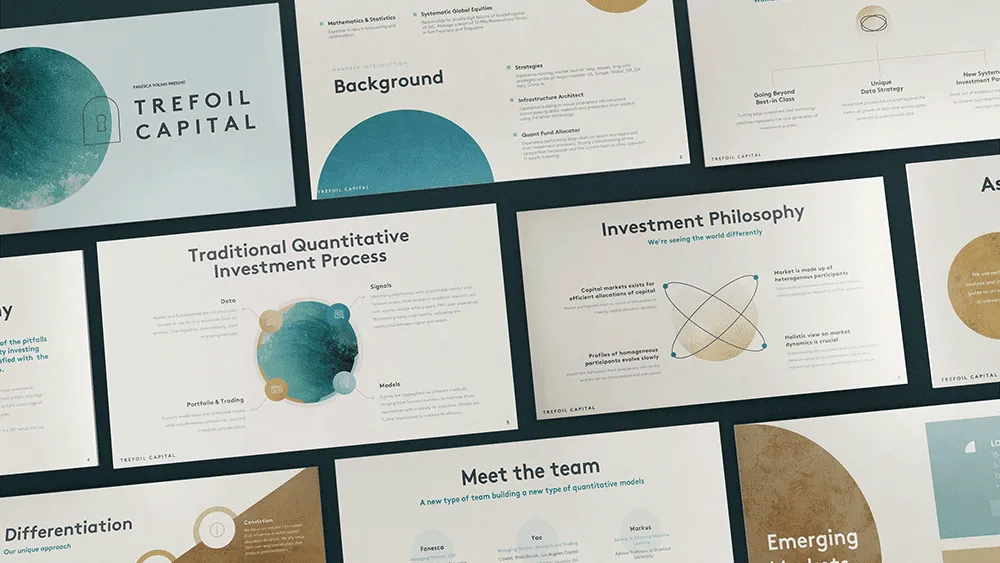
Trefoil needed a trifold brochure that could carry their corporate identity without feeling generic. We built a structured, visually strategic piece where every panel had a job to do and nothing was there by accident.
Trifold formats are deceptively hard to get right. The space is limited, the reading order is non-linear, and most corporate trifolds end up either too text-heavy or too vague to be useful. Trefoil needed something that communicated who they are with clarity and confidence, while staying true to their brand.
The client had strong brand guidelines and a clear sense of identity. The challenge was translating that into a format that works as both a leave-behind and a standalone introduction to the company.
We started by mapping the content across all six panels with intention. Each panel was assigned a clear purpose before any design work began. The cover needed to make an immediate impression. The inner panels needed to build the story. The back needed to close with confidence.
We worked closely within Trefoil's branding system, using their color palette, typography, and visual language as the foundation. Design flourishes were kept deliberate. Nothing was added for decoration alone.
The layout was built for quick scanning. A busy decision-maker should be able to pick it up, read it in under two minutes, and walk away with a clear picture of what Trefoil does and why it matters.
A fully designed trifold brochure built to Trefoil's brand standards. Print-ready, visually cohesive, and structured to guide the reader through a clear narrative from cover to close.
A corporate brochure that feels like an extension of the brand rather than a summary of it. Clean, considered, and built to leave the right impression in any room it enters.


.jpg)